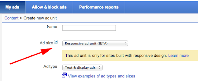
New trend in blogging platform is responsive style. Now most of the blogger diverting on responsive template. But actually what is responsive? I can explain you simply that responsive is a style which can be adjust within any resolution of device. Such as Desktop, laptop, Smart phone, palmtop, smart tab related device. more clearly, Responsive web design allows you to vigorously control the display of your blog or website according to the screen/device. That means a blogger template can be seen easily in any device. So apart from this you have to think about your other things that should be responsive otherwise your template can't be properly display in all device. Advertise is a biggest thing which we must make responsive to make our blog pure responsive.
Early in August 2013 Google AdSense officially introduced ad support with Responsive Style. By using a responsive ad unit, you can control the size of the ads on your any section. But this is still in the Beta version of the stage but it need to develop more. Because AdSense ads are doesn't match the size with the pixels. Responsive AdSense does not flow and roll up like a Responsive apparently on images and video.
For example we want to display the ads whose max-width: 350px that means we have to determine who is advertising supported and in accordance with this resolution, Suppose we have added 728px X 90px Ad unit and when we will watch in smart tab then it will turn into 468px X 60px ad unit.
Now I am providing an example below by a standard source code of AdSense (320px X 50px) in responsive mode-
<style>
.bs-responsive { width: 320px; height: 50px; }
@media(min-width: 500px) { .bs-responsive { width: 468px; height: 60px; } }
@media(min-width: 800px) { .bs-responsive { width: 728px; height: 90px; } }
</style>
<script async src="http://pagead2.googlesyndication.com/pagead/js/adsbygoogle.js"></script>
<!-- OOM-RESPONSIVE -->
<ins class="adsbygoogle bsm-responsive"
style="display:inline-block"
data-ad-client="ca-pub-xxxx"
data-ad-slot="yyyy"></ins>
<script>
(adsbygoogle = window.adsbygoogle || []).push({});
</script>
How to modify it to display Adsense Responsive?
So now I will explain how to modify all of AdSense ad units in responsive way. To make responsive we have to modify the CSS and have to select which ads we want to displayed according to their size in media queries-
<style>
@media(min-width: 240px) { .bs-responsive { width: 234px; height: 60px; } }
@media(min-width: 320px) { .bs-responsive { width: 250px; height: 250px; } }
@media(min-width: 480px) { .bs-responsive { width: 468px; height: 60px; } }
@media(min-width: 768px) { .bs-responsive { width: 728px; height: 90px; } }
@media(min-width: 1024px) { .bs-responsive { width: 468px; height: 60px; } }
@media(min-width: 1216px) { .bs-responsive { width: 728px; height: 90px; } }
</style>
<div style="text-align:center">
<script async src="http://pagead2.googlesyndication.com/pagead/js/adsbygoogle.js"></script>
<!-- BS-RESPONSIVE -->
<ins class="adsbygoogle oom-responsive"
style="display:inline-block"
data-ad-client="ca-pub-xxxx"
data-ad-slot="yyyy"></ins>
<script>
(adsbygoogle = window.adsbygoogle || []).push({});
</script>
</div>
In the above code you would find first part is CSS which is under <style>.......</style> and <div...........</div> is the main ads code which will provide by Google AdSense.
How to Make Google AdSense Ad Units Responsive with JavaScript?
I am also providing a trick that you can make your AdSense responsive with Java Script. This trick is pretty cool that will work automatically in all of your AdSense ad units.
<div id="adsbygoogle">
<script type="text/javascript">
adUnit = document.getElementById("adsbygoogle");
adWidth = adUnit.offsetWidth;
google_ad_client = "ca-pub-number";
if ( adWidth >= 770 ) {
/* Leaderboard 728x90 */
google_ad_slot = "Ad Slot number";
google_ad_width = 770;
google_ad_height = 90;
} else if ( adWidth >= 468 ) {
/* Banner (468 x 60) */
google_ad_slot = "Ad Slot number";
google_ad_width = 468;
google_ad_height = 60;
} else if ( adWidth >= 336 ) {
/* Large Rectangle (336 x 280) */
google_ad_slot = "Ad Slot number";
google_ad_width = 336;
google_ad_height = 280;
} else if ( adWidth >= 300 ) {
/* Medium Rectangle (300 x 250) */
google_ad_slot = "Ad Slot number";
google_ad_width = 300;
google_ad_height = 250;
} else if ( adWidth >= 250 ) {
/* Square (250 x 250) */
google_ad_slot = "Ad Slot number";
google_ad_width = 250;
google_ad_height = 250;
} else {
/* Ad Link Unit (200 x 90) */
google_ad_slot = "Ad Slot number";
google_ad_width = 200;
google_ad_height = 90;
}
</script>
<script type="text/javascript"
src="http://pagead2.googlesyndication.com/pagead/show_ads.js">
</script>
</div>
Customization
- Replace ca-pub-number with AdSense cab publication number.
- Replace Ad Slot numberwith AdSense ad slot number.
So I hope this tutorial help your to make your AdSense pure responsive until releasing of full version of Google. If you have any suggestion please share with us.


EmoticonEmoticon